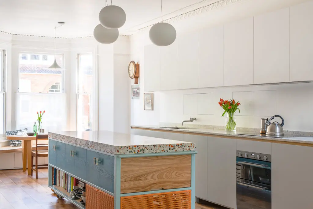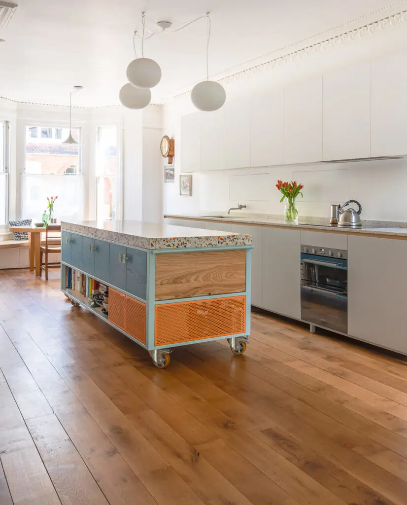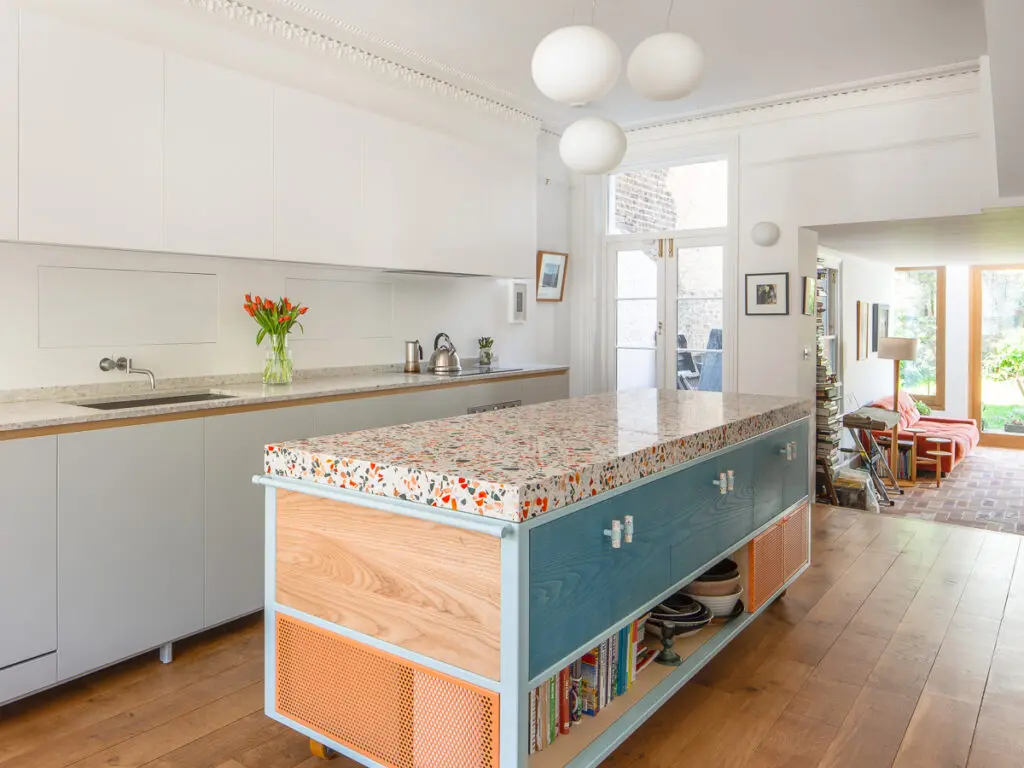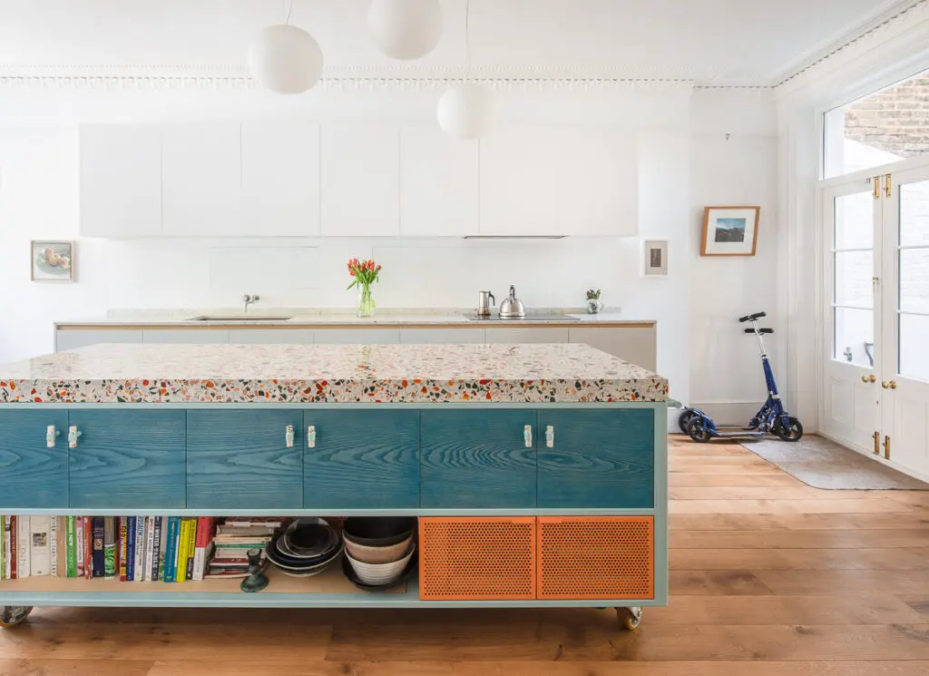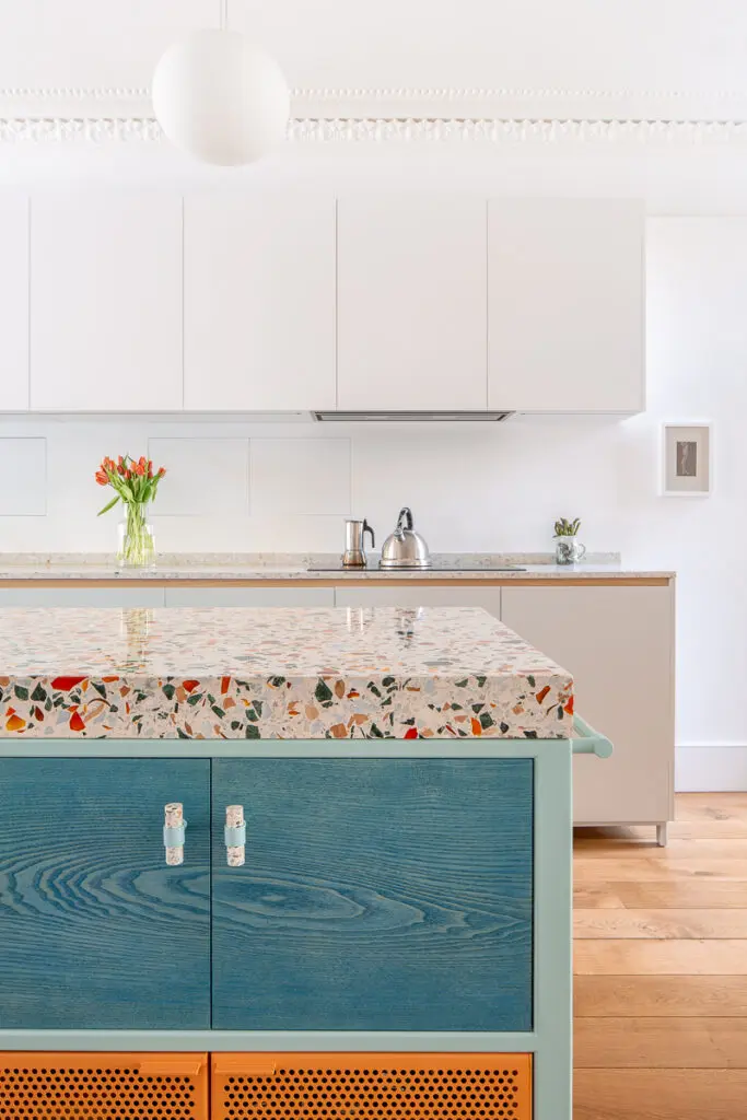
Diespeker loves it when clients are fired up with their own creative ideas for bespoke terrazzo projects. We recently worked with Witlof Design to achieve exactly the look wanted for two kitchen worktops for clients Harriot and Will. We asked Witlof designer Fiona Ginnett about the process.
What prompted you to consider terrazzo as a surface for the kitchen worktops?
We had been looking at terrazzo for a while and had proposed it for a few projects but were yet to find a client who was brave enough! I absolutely love the material for its simplicity and endless potential. It is merely chips of waste material cast in either cement or resin then polished up – such a simple and ancient production process but with so many possibilities. Just by varying the size, type and colour of the aggregate and the colour of the resin base you can achieve a completely different aesthetic.
Had you heard of terrazzo before?
Yes – but I associated it with large municipal buildings! However, I have always been interested in decorative surface techniques and was aware of the process through research into the Art Deco period while I was studying.
The design was based on the colours in a handblown glass bowl owned by the client. How did this come about?
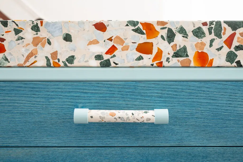
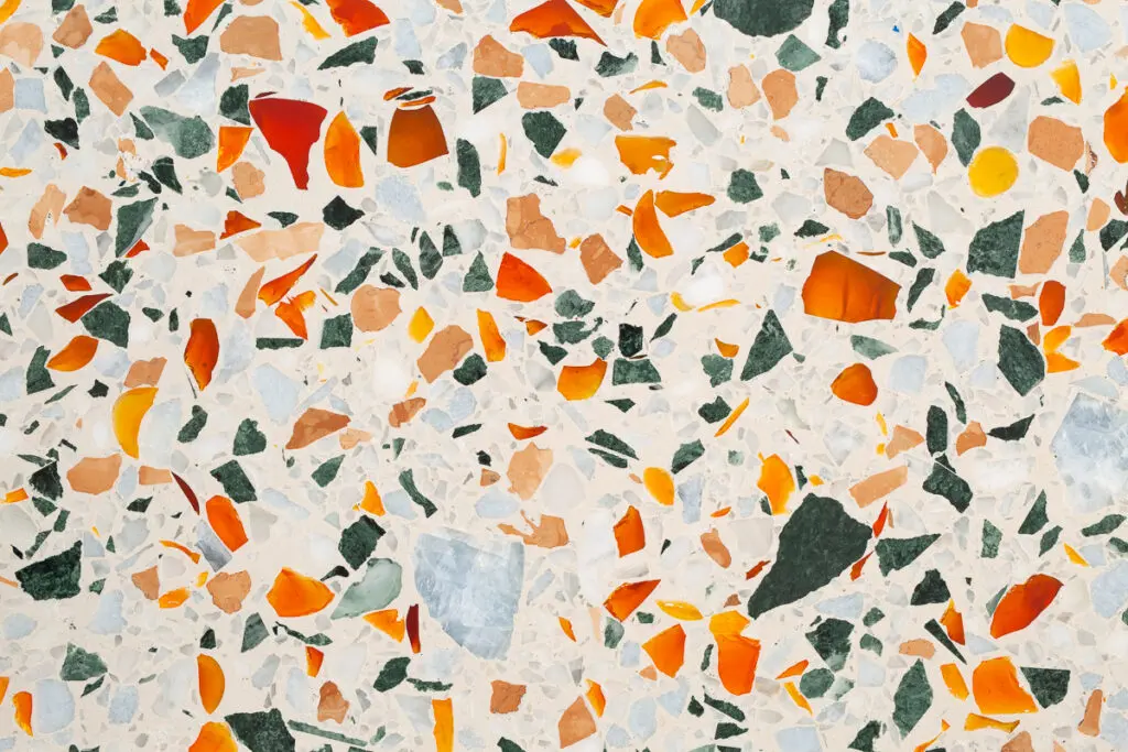
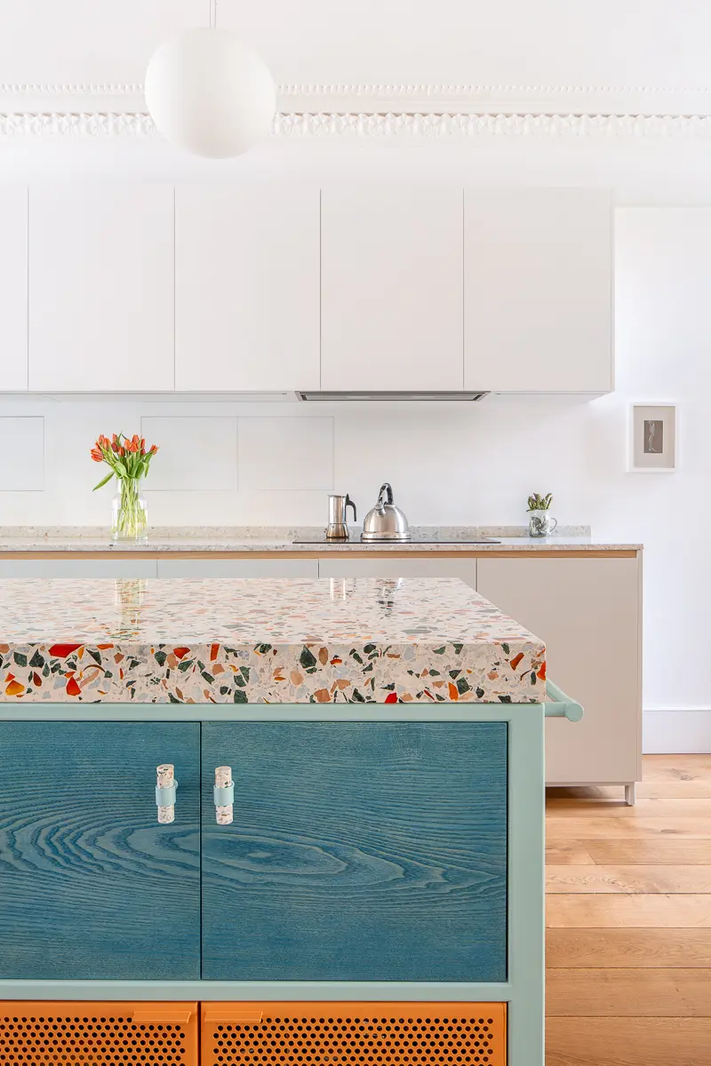
Harriot and Will have several beautiful objects in their home including a Peter Layton glass bowl. We always find these references to be the most useful as they are most indicative of what the client truly loves. In this case their brief for us was one of our favourites yet – they wanted to include the colours from this bowl including the ‘starburst orange’ in their kitchen! We were looking for a way to bring in the colour throughout the design process then when we visited the showroom and Harriot spotted the glass chips, the penny dropped!
How many samples did you see before choosing the one you wanted?
We were quite clear about what we wanted so we actually only had 2 samples made up.
What was your reaction to seeing the finished countertop? Was it as you imagined?
We were exhausted as we had just completed the installation, so my first reaction was relief that it had all arrived in one piece and in time for Harriot and Will to host Christmas. When we had time to stop and take it all in, we were mesmerised by the surface – the glass adds such depth and I love that no two sections you look at are the same.
You chose a more standard, subtle terrazzo for a second countertop – what was the thinking behind this?
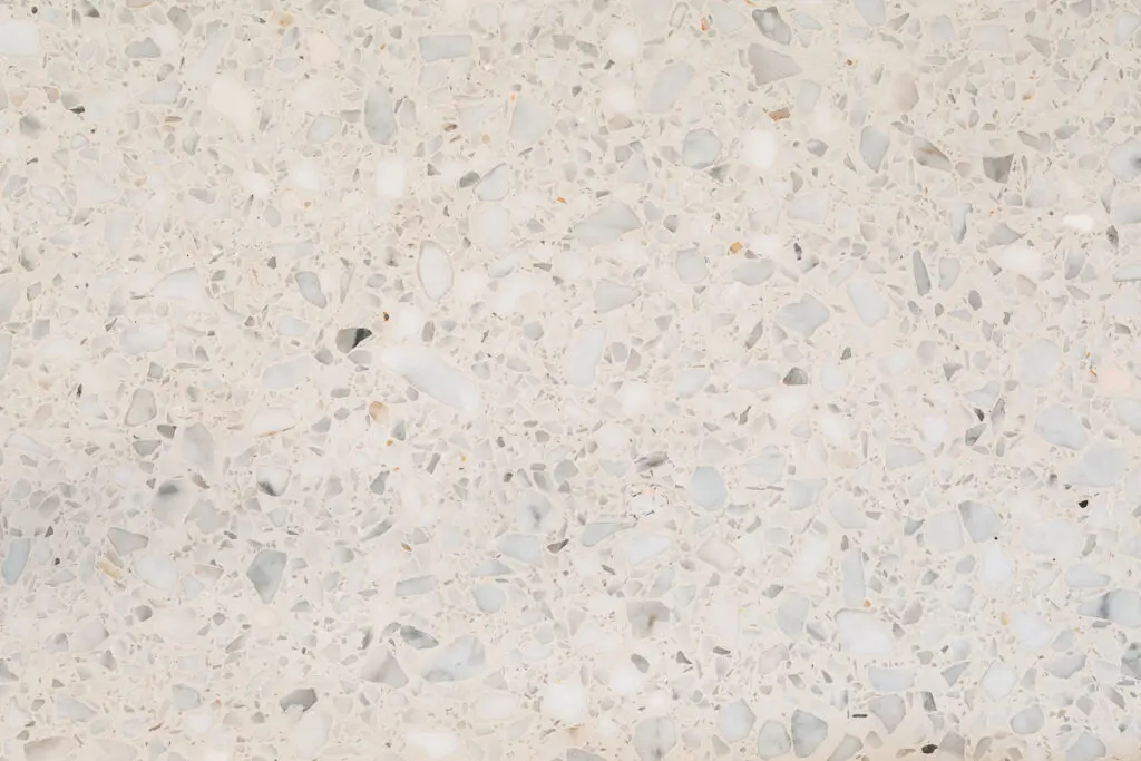
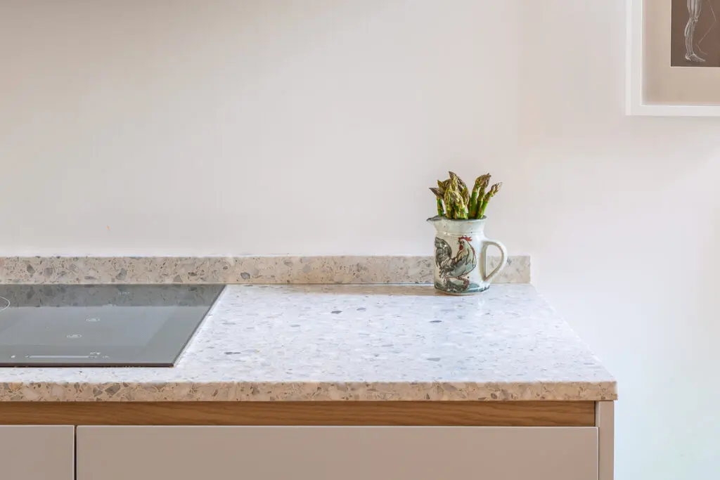
Harriot and Will didn’t want the ‘working’ part of their kitchen to be too obvious so we decided to have the main run almost disappear into the wall by making it tonal in shades of white and grey with just the subtle ash handle pull detail to bring some warmth. This made the island the main event.
It’s a beautiful kitchen, what is it you like most about it?
It was our most adventurous project to date and Harriot and Will’s challenging brief gave us lots to get our teeth into. But what I like most about it is that all of our projects as a collaboration with the client and in this one you can see the family everywhere you look. They were an absolute joy to work with and their charisma and lust for life is evident in the kitchen.
And a word from Harriot:
“I had heard of terrazzo but to me it meant Tube station and supermarket floors. I would never have thought of it for our worktop. If you’re going for a bespoke kitchen, there are no boundaries, in theory. Witlof’s process was like a branding exercise. Fi and Tom came to us with mood boards and asked us to pick the textures, colours, shapes we loved. Then we showed them some of our favourite things, including the bowl. Will gave it to me for a ‘Big’ birthday. It was made by Peter Layton – he’s sometimes called the ‘father of studio glass’, not that we knew that when we visited his studio. The V&A had an exhibition of his work fairly recently. What I have always loved about the bowl is having that kapow of jewel colour in a white space. It’s the same for our worktop.
The project wasn’t just replacing a kitchen. We completely rejigged our ground floor to make our house easier to live in. The deeper we got into the project, the higher the expectations. My dread was of going to such enormous lengths and expense to end up with something…well, meh.
The other consideration was that with the new layout visitors would come straight into the kitchen. I wanted it not to be too kitchen-y – to have a long wall of units that would vanish into that wall, almost camouflaged with its quiet terrazzo. Then we’d have a fabulously loud and shouty island (which is on wheels so that we can move it out of the way).
Fi showed me some terrazzo samples. I liked the idea and muscled in on a visit she had planned to Diespeker. While we were waiting we had a chance to look at the panels of different aggregates in the showroom. My one reservation had been that the stone colours were a bit, well, quiet. But there was a panel of glass chippings that looked like boiled sweets. The quest began to find the right orange. We saw some pieces that were more amber. But it needed to be Halloween bright. And it is. Definitely not meh.
I absolutely love my new kitchen. Everything about it. It gives me huge pleasure every day. And I especially love seeing people’s reactions to the island, with its lovely shouty terrazzo. The whole project has transformed how we live in our house, how we feel about our house. This may sound daft, but it has brought us joy.”

